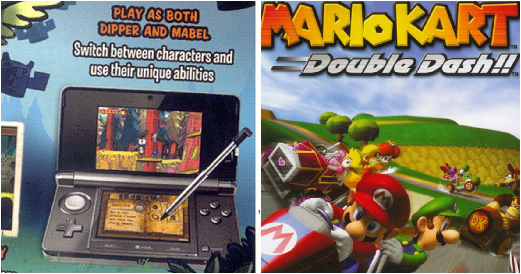
Box art is the thing that draws in a lot of people to games they might not have otherwise checked out. If you see a game you've never heard of just sitting on the shelf in a game store or while you're online shopping, an interesting cover might be the thing that makes you pick it up to see what the game is all about and possibly even buy it. Because of this, video game studios put a lot of time and effort into creating the perfect box art.
Unfortunately, even all the time that they spend making amazing box art is sometimes not enough. Even with a team of designers and other people working at the studio who check it over before it ships out, mistakes can still slip through the cracks. Throughout the years, there have been quite a few big mistakes on the box art of video games. From stray watermarks to embarrassing typos and mistakes that are just plain strange, it's pretty funny to see a video game company make a mistake on the box art for a game.
To see 10 of the worst box art mistakes, keep reading!
10 Okami
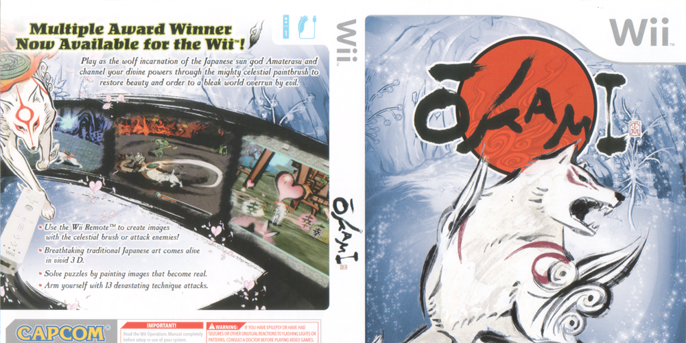
The mistake on the box art for Okami on the Wii is definitely one of the most well-known and unusual mistakes on this list. Okami is an action-adventure game that was released in 2006 and features the Japanese sun god Amaterasu as the main character. The Wii's box art features this character with a lot of abstract swirls and an art style that matches the unique one of the game.
What could the problem be with this beautiful box art? Eagle-eyed fans noticed that if you look really close up by Amaterasu's mouth on the cover for the Wii version of the game, you can see the smudge of a watermark that wasn't properly removed. The watermark is IGN's logo and it's not clear why the developers used an image from IGN's review instead of just using their own original art, but it was definitely a strange choice.
9 Crash Tag Team Racing
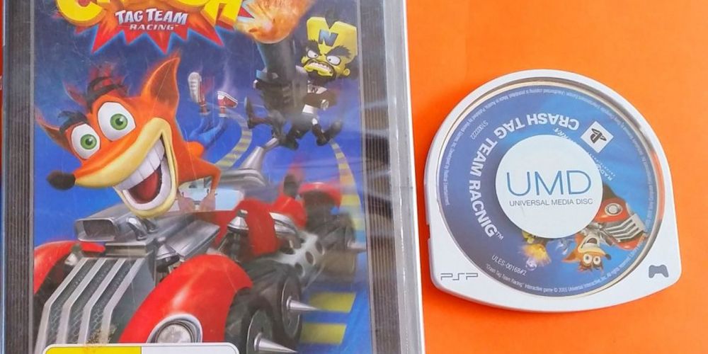
This mistake is actually on the front of the disc, not on the actual cover of the game. But it's still a glaring mistake that you won't be able to unsee after you hear that it's there. On the UMD for the PSP version of Crash Tag Team Racing, there's a massive typo.
The disc features the same basic box art from the cover with Crash Bandicoot in his vehicle and the title of the game is below it. But, if you look closely at the title on the disc, you may notice that it doesn't say Crash Tag Team Racing. Instead, there's a typo that left the word "racing" misspelled.
8 Blast Wind
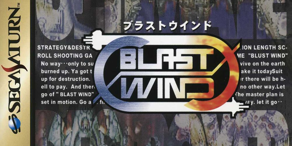
Blast Wind was released on the Sega Saturn in 1997. It was never released outside of Japan, which may help to explain this typo. On the cover, behind the title of this beat 'em up-style game, there's a paragraph of seemingly nonsensical work to bring some detail to the cover art.
If you look closely at the words behind the title on the cover, you'll see that it says the title of the game in a couple places. Unfortunately, one place where it says the title, there was a major typo that left it saying, "BLUST WIND," instead of the real name of the game.
7 Virtual Lab
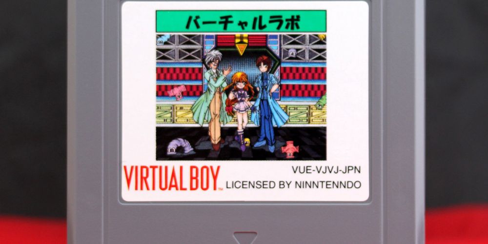
Virtual Lab was one of only a few games that were developed for Nintendo's failed console the Virtual Boy. This game was only released in Japan and hit the shelves in 1995, shortly before the console was discontinued. There were a lot of issues with this console and despite being a failure when it launched, the console has become quite a collector's item.
If you look at the cover for Virtual Lab, there's small text next to the Virtual Boy logo that declares that this game was licensed by Nintendo. Wait, no, it says it was licensed by "Ninntenndo." This typo is a pretty funny one because of the fact that they put the extra "n" in Nintendo in not one but two places.
6 Gravity Falls: Legend Of The Gnome Gemulets
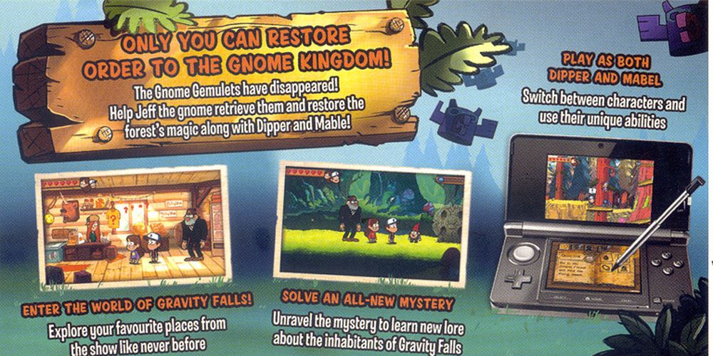
Gravity Falls is an animated TV series that has fans of all ages. The fact that a video game for the Nintendo 3Ds was created based on this show is no surprise considering how popular the series has gotten since it originally began airing.
In the game, players control Dipper and Mabel, characters from the TV show, as they solve puzzles and try their best to save the Gnome Kingdom! The back of the box art says the names of the two characters a couple times, but one of them spells Mabel's name wrong and refers to her as "Mable." This is especially funny considering the fact that her name is only a few inches away, spelled correctly.
5 Resident Evil Revelations
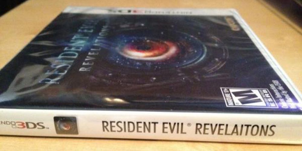
The Resident Evil franchise is one that has been huge in the world of survival horror for a long time. Considering the fact that this series is so popular, one might think that the developers would put a lot of work into making sure that the cover art is completely perfect, right? Unfortunately, even all that careful checking and work didn't stop Resident Evil Revelations from shipping with a typo.
The side of the box art for the Nintendo DS reads, "Resident Evil Revelaitons." Uh oh! Capcom even released a statement about how "embarrassing" the typo was and offered replacement cases for anyone who didn't want to see the typo in their game collection.
4 Mario Kart 8
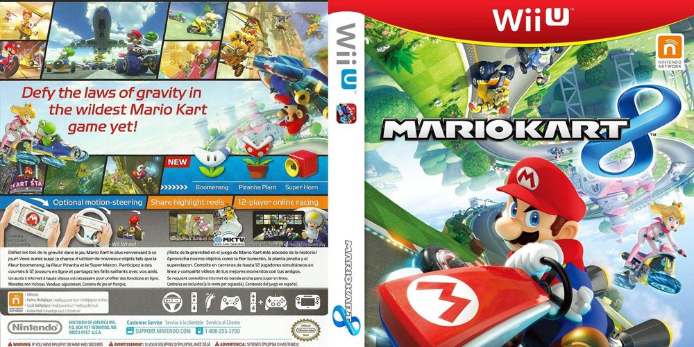
Mario Kart 8 was released on the Wii U and is like other games in the Mario Kart franchise. This game involves a variety of different Nintendo characters racing around different tracks in order to cross the finish line first. It's fun, it's frustrating, and it's a party classic.
The cover features a variety of the characters driving around on a twisting course and definitely shows off the fun action of the game. The game shows Mario and Peach steering their vehicles toward the viewer and are facing forward. But, if you look at the other half of the track where Bowser and Luigi are driving, they're going in the exact same direction despite being around a curve. Someone must be driving backwards!
3 Superman 64
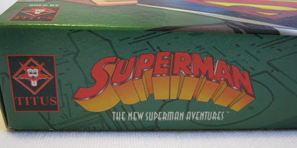
Superman 64, known officially as Superman: The New Superman Adventures, was released in 1999 on the Nintendo 64. This game suffered from a rushed development schedule and ended up being on the receiving end of quite a few negative reviews after it was released. The rushed development definitely didn't stop at the actual gameplay.
The game's logo isn't featured prominently on the front of the box, but it is on the sides and back of the box. Wherever the game's logo is featured, there's a massive typo in the word "adventures" and the logo instead reads, "Superman: The New Superman Aventures."
2 Mario Kart: Double Dash
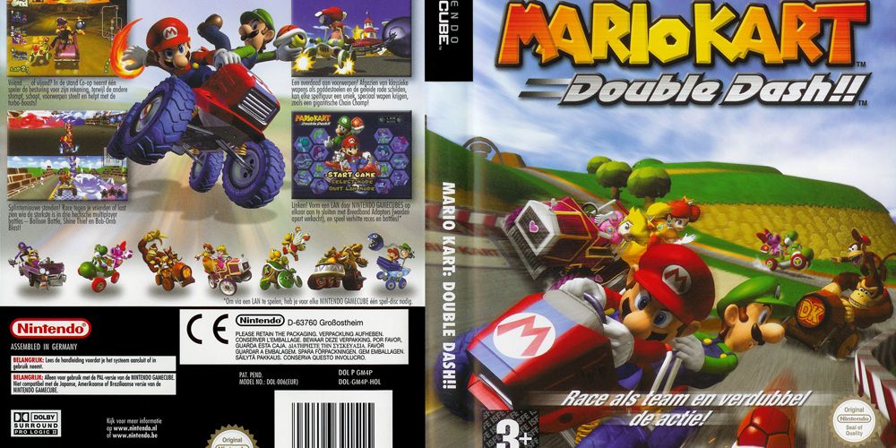
Mario Kart: Double Dash was released on the Nintendo GameCube in 2003. It's got similar gameplay to other Mario Kart games and, just like Mario Kart 8, features a pretty silly mistake on the cover of the box art.
If you look closely at the obscured view of Luigi's hat that we get on the cover, you'll see that the signature "L" on his cap is backwards! Many fans speculate that this is because the cover was originally mirrored and that they flipped Donkey Kong's "DK" back, but forgot about Luigi's hat.
1 Pharaoh's Tomb
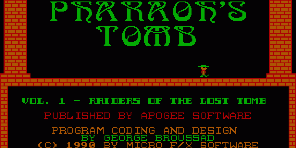
This typo is actually one that appears on the title screen after the game is loaded, but it's still a major mistake that is hard to believe no one caught during development. Pharaoh's Tomb is a DOS game that was created by George Broussard, one of the creators of the Duke Nukem series.
Since Broussard was behind the creation of this 1990 platforming game, his name obviously appears on the title screen every time a player loads the game up. Unfortunately, Broussard's name was spelled incorrectly on this title screen and instead reads as "Broussad."
from Game Rant - Feed https://ift.tt/38xz1Uy
Comments
Post a Comment