Video game names can get pretty dumb. They can be nonsensical to the average gamer who doesn’t stay clued into the game industry. What exactly is a “Silent Hill” or a “Resident Evil?” Those names don’t convey much.
Catching up on news and watching trailers online is the most helpful way to decide on what game to buy, but there is another way to get information out there to the consumer: box art. That brings this article to part two, GameStop. Sometimes workers need to get creative with the boxes as games are often traded in without the cover and or a box at all. Are these covers helpful, or just silly?
10 Harry Potter And The Order Of The Phoenix
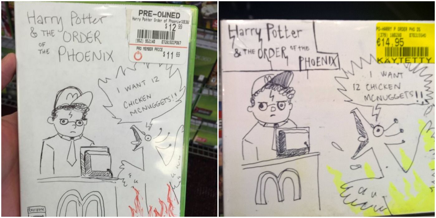
Let’s begin with an excellent example of exactly what this article is trying to capture. If one takes the title literally, it could mean Harry Potter and the Phoenix’s order. Why he was chosen to work at McDonald’s rather than some magic fast-food chain is beyond anyone’s guess.
What should be noted is Harry’s sullen face as the Phoenix screams out his order. Fast-food employees can relate to this on some level. The fact that this doodle made it onto an Xbox 360 box and DS one makes it even more priceless.
9 Tiger Woods
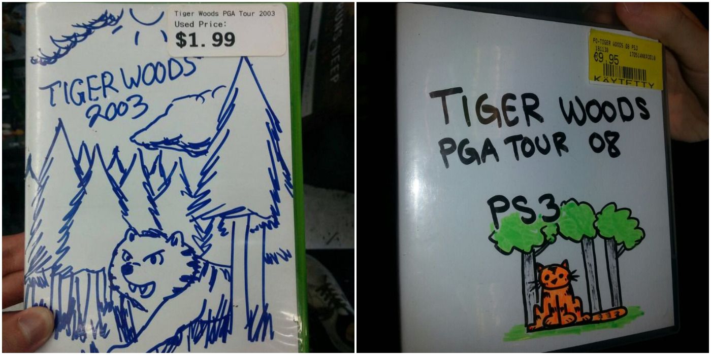
Let’s face it. As good as the Tiger Woods golf games were, they do not hold a candle to what both of these copies seem to imply. That is to say, what if these games were about literal tiger infested woods?
That then begs the question on the subject matter. Is someone is going in to hunt them, or are players controlling the tigers? On a related note, there was not a doodle found, but imagine what a Tony Hawk game could be like.
8 Saint’s Row 2
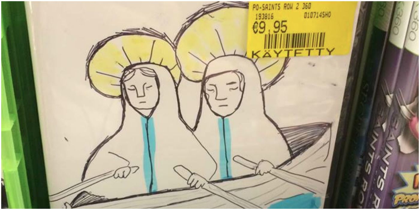
To the non-gamer what does Saint’s Row bring to mind? The title is about a street gang and their territory, or row. Taken quite literally this GameStop Michelangelo depicted two saintly figures rowing a boat.
That is a dad joke classic. It may make some roll their eyes while making others want to frame that in a highlighted glass case for all to see. As a game, it sounds boring in concept, although it could be like a vision quest through heaven sort of like Journey. That actually sounds great.
7 Dragon Ball: Raging Blast
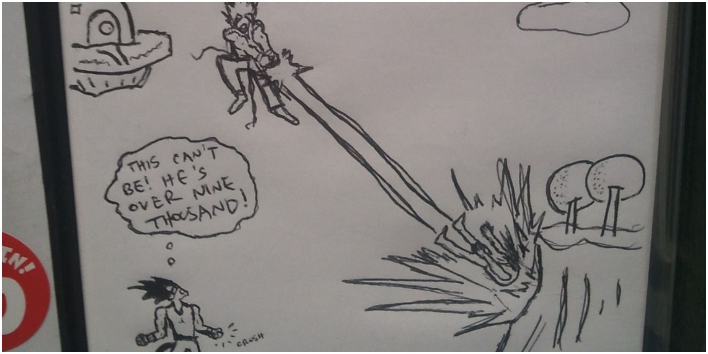
Dragon Ball: Raging Blast is one of the many, many fighting games based on the anime. There is truly nothing special about this PS3 and Xbox 360 game. However, this custom art is not only funny, but it is legitimately good.
Small, but still better than a lot of these employee covers. Sure, the “over 9000” joke is a little played out at times, but popularity on it comes and goes. Right now, it’s just the right amount of goofiness one needs.
6 How To Train Your Dragon
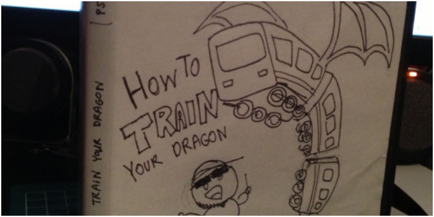
It takes a couple of seconds to actually get this joke cover because it is a stretch. Based on the name alone, it sounds pretty straightforward in that this should be about someone training a dragon like one would train a dog.
This artist, however, poses the idea that the dragon is a train. Or maybe they are trying to infer that this game explains how to turn one’s dragon into a train with the box depicting an almost complete transformation. Like great art, it should cause a lively debate. There are no right, or wrong answers, just laughs.
5 Sleeping Dogs
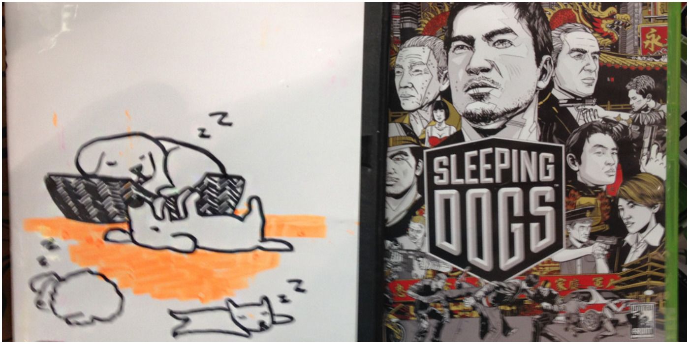
This is a pretty obvious parody as Sleeping Dogs is a pretty nonsensical name. It comes from the saying “let sleeping dogs lie” which basically means leave things as they are. The game is about a cop going undercover to infiltrate a gang.
The saying could then pose the question if cops should go under cover in the first place, or should they let gangs solve their own troubles. It makes sense when one plays it, and it is also a highly praised and recommended game. However, one cannot deny a game about watching literal sleeping dogs would be fun as well in every adorable sense of the word.
4 The Elder Scrolls
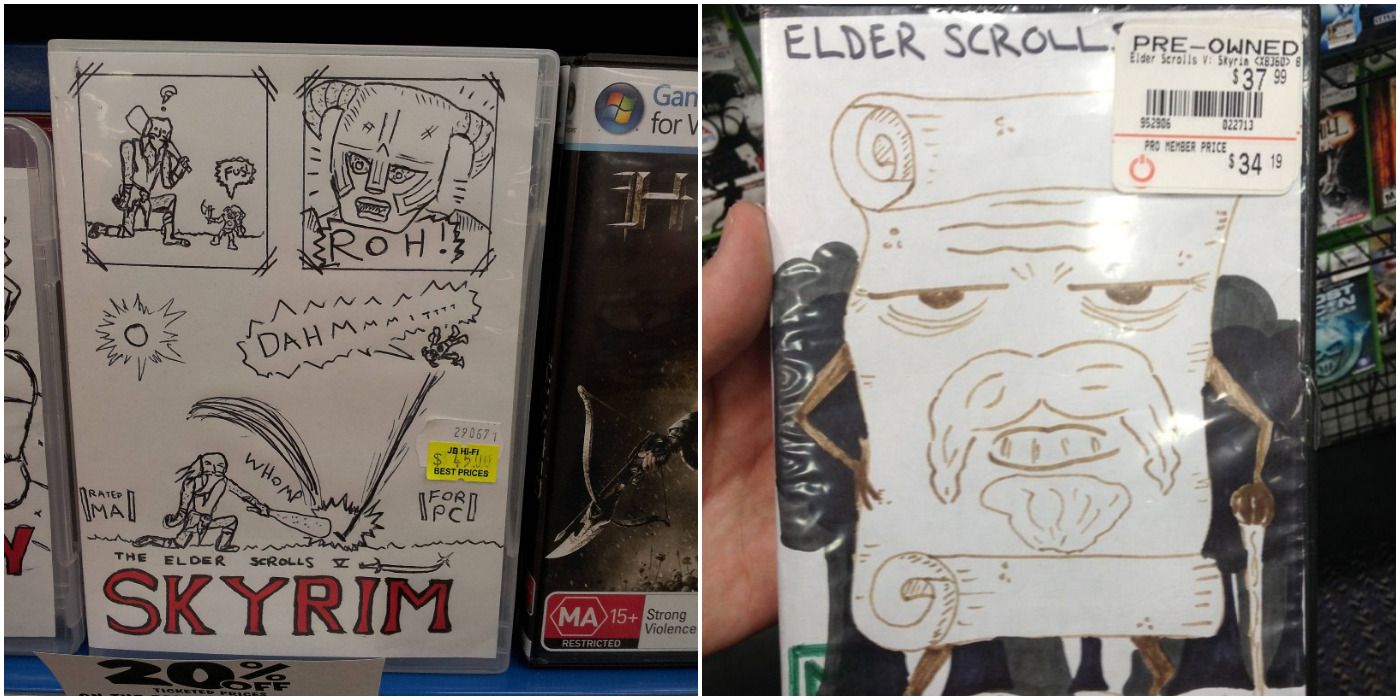
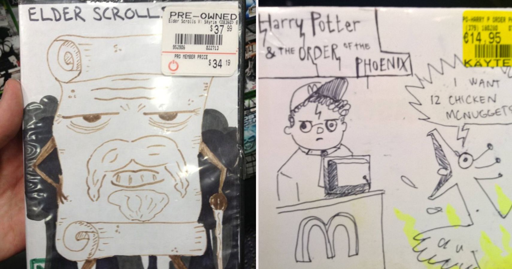
This entry includes two artworks for Skyrim because it was too hard to just choose one. Anyone who has played Skyrim knows that much of the game involves boldly running up to giants to then get bashed away into space. The comic is on point and hilarious.
The second half shows a literal old scroll is equally funny thanks to the art. There was one for Oblivion as well, but the language got a little too blue for this article.
3 Super Smash Bros.
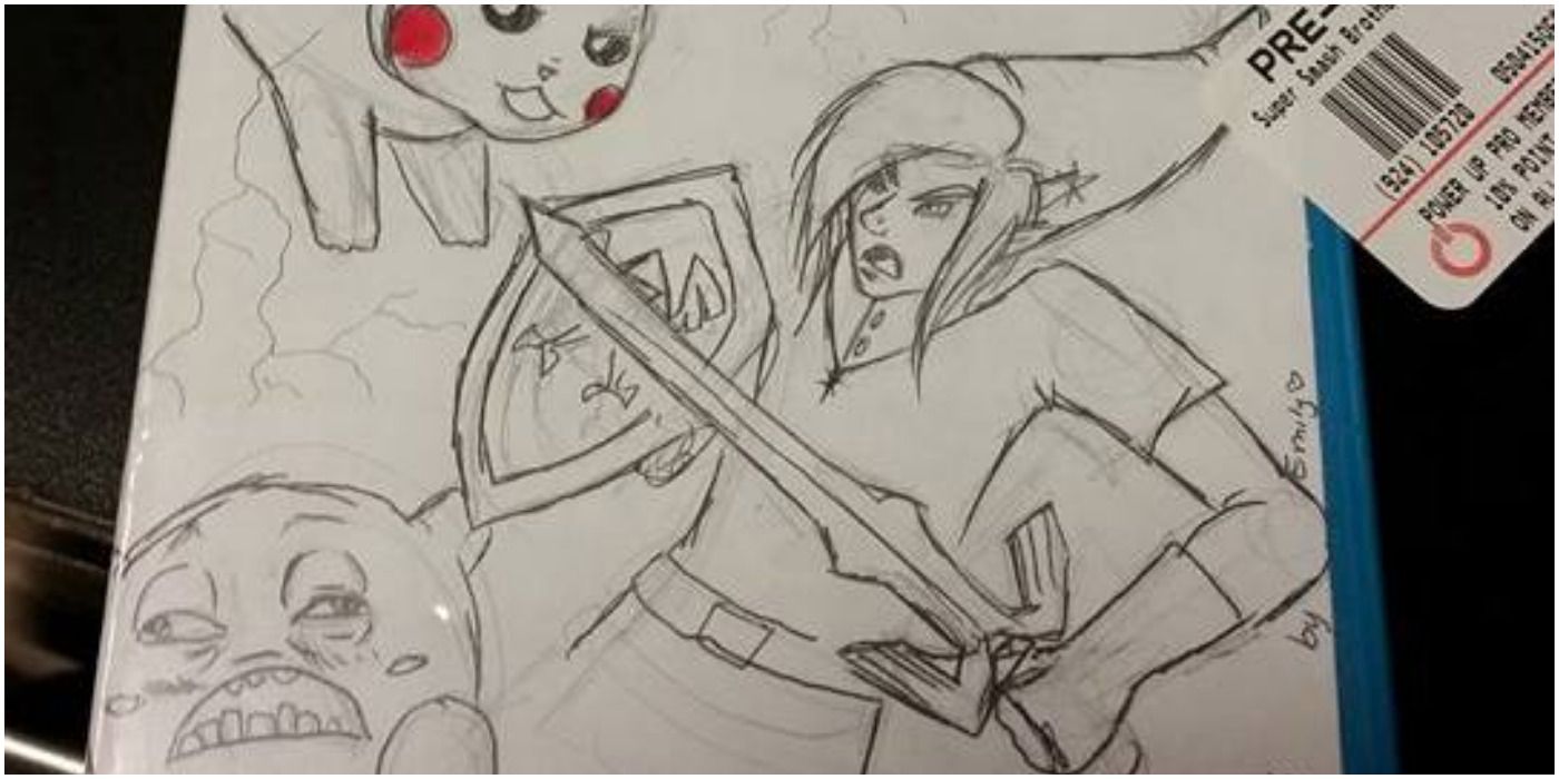
This new cover art for the Wii U version of Super Smash Bros. is pretty normal, almost. Pikachu, Link, Kirby, and the Town Villager are clashing for supremacy. It would be normal all except for Kirby’s face, who looks like he has to go to the bathroom.
That plus the fact his face is too human, what with the teeth is uncomfortable. It’s funny in a creepy sort of way. True gamers know Kirby is a secret sociopath. He eats things while they are still living. Think about that.
2 Mortal Kombat
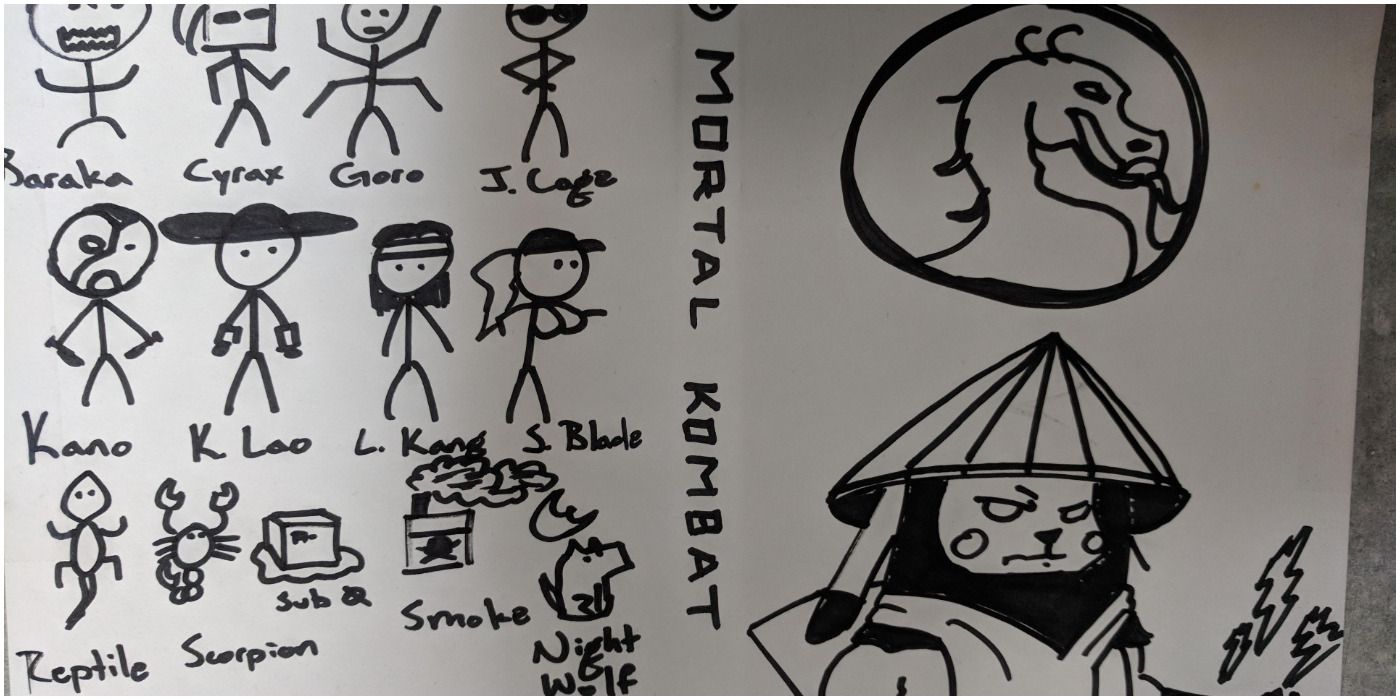
It’s hard to tell what Mortal Kombat this cover is for, but that is beside the point. This artist thought it would be funny to put Pikachu cosplaying as Raiden on the cover, and they would be right. It is hilarious. It also works since they are both electrical powerhouses.
On the back of the box, they drew stick figures to represent other characters, which is also charming, but then others were depicted more literally. Subzero is an ice cube, Smoke is a pack of cigarettes, Scorpion is a scorpion, Reptile is a lizard, and Night Wolf is a wolf with a moon by him.
1 Call Of Duty
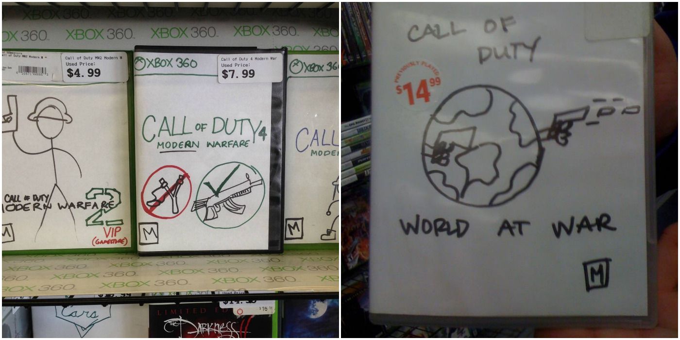
This is also a combo piece because, again, it was too hard to resist putting more than just one entry on here for Call of Duty. First of all, substituting a slingshot for a rifle does constitute modern warfare in the year of its release. That said, an average consumer could assume then that the other games in the series before this either involved children or was about Biblical battles like David vs. Goliath.
Now that would be a Call of Duty game. Not to be outdone, World at War depicts the Earth dual-wielding pistols as a literal world ready for action. Hideo Kojima, Swery65, or Suda51 would be great choices for directors on that bizarre project.
from Game Rant - Feed https://ift.tt/3bqn1Fo
Comments
Post a Comment