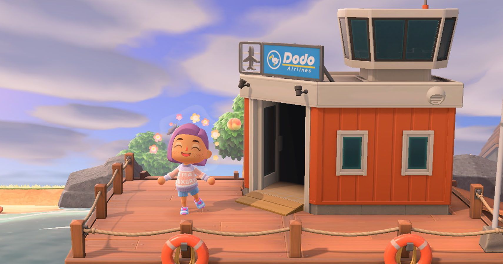
Color preferences will always be subjective, but that doesn’t mean artists can just regurgitate random colors together and hope for the best. Both art design and art direction are far deeper than that, requiring an eye for color composition and a decent understanding of color theory. One might think this can’t possibly affect Animal Crossing– let alone in regard to some ranking of airport colors– but the colors chosen for the airport and how they pair with the island’s surroundings can add considerable volume to New Horizons’ setting, tone, & themes.
Not just that, the right airport color can make it easier to recognize the intricacies of New Horizons’ art direction. In typical Animal Crossing fashion, there’s an emphasis on green, but it’s softer than it's ever been– trading deep green fields for light greenery that seamlessly transitions onto the white sands of each island’s beach. Toss in blue from the sea & the game’s dynamic lighting, and New Horizons really does embody its tropical aesthetic well.
Which isn’t necessarily the best thing depending on your color preferences. All airport colors are fairly solid– resulting in some potentially harsh tones that might contrast poorly with the airport’s immediate surroundings. Not just that, as the airport is one of the few fixtures players can’t customize after the fact, it becomes all the more important to make peace with your airport color right away. New Horizons lets players control almost everything on their island, but Animal Crossing fans only have one chance at the perfect airport color.
4 Green

As the Animal Crossing franchise’s main color, so to speak, green should pair well with the island. After all, the island’s main flag is the very same shade of green– but that in itself shines a spotlight on a certain problem. New Horizons, in typical franchise fashion, is loaded with a considerable amount of greenery. It’s to a point where players will almost certainly want to decorate around the green instead of complimenting it.
It makes sense, honestly. Green tones can be a bit harsh when they’re bright. Trees have the benefit of shading to darken their leaves, but the green airport and green seaplane look outright tacky. There’s an incredibly artificial quality to the green, especially when looking at it paired against the deep blue sea.
The green used here is also a lighter, spring green, albeit one that lacks a pastel quality to soften it. As a result, the green even clashes with New Horizons’ tropical theme, neither soft nor dark enough to match potential island flora. That said, it’s entirely possible a green airport will bring considerable life to an island during those snowy, winter months.
3 Red
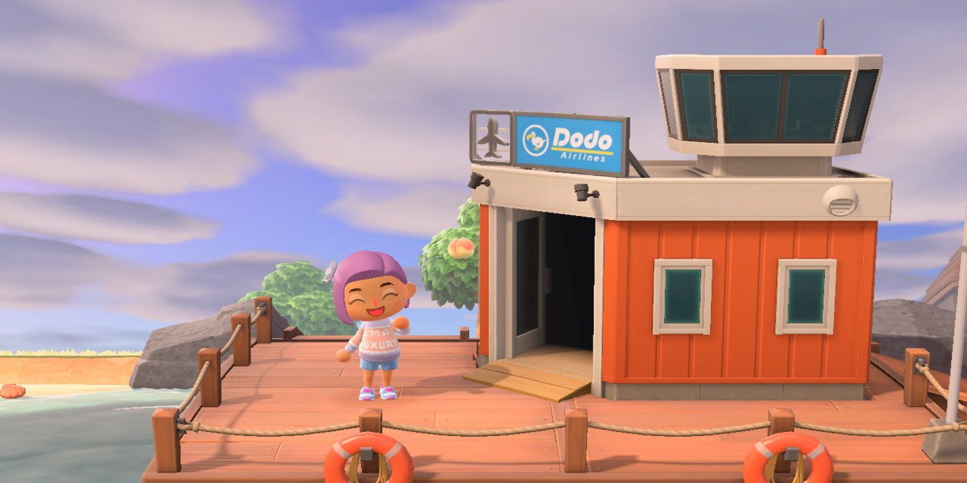
It’s worth pointing out that the airport’s color is completely and entirely random. There is absolutely no telling what it’ll be. Taking into consideration the fact this randomness also applies to fruits, and any players looking for a specific fruit with a specific airport color is going to be in for quite the ordeal– we’re talking hours of potential resetting. All the same, said resetting might be worth it for anyone who ends up with a red airport.
Where green was tacky, red is a bit too loud for its own good. To its credit, the roof of the red airport and the red seaplane actually play off the boardwalk and the lifebuoys. The red tint of the airport also has shades of orange, softening the color scheme considerably. At first glance, it’s pretty decent, but it immediately clashes with the greenery of the island.
The way it contrasts with the blue of the sea loses its luster rather quickly, as well. The airport’s color scheme calls attention to itself, but without any of the fire the color red has– subdued by that orange. If nothing else, a red airport does look better than green.
2 Yellow

As a naturally loud and bright color, it makes sense that some might be apprehensive towards yellow’s presence. Of the three subtractive primary colors (red, blue, yellow,) however, yellow’s lighter color scheme allows it to pair with more colors– the softer the yellow, the more white it appears, allowing it to subtly highlight details. Of course, this isn’t quite the case with New Horizons’ rendition of yellow, but a yellow airport looks leagues better than red or green.
Thematically, yellow manages to perfectly fit New Horizons’ tone while also circumventing green and red’s weak spots. Notably, yellow pairs well with the greenery that green so garishly clashes with, while bringing a boldness to the idea without being a sore spot like red, calling attention to itself and generally sticking out poorly.
Yellow pairs off the lighter beach, the green fields, the deep blue sea, and it arguably brings out that crispness in the green flag that tacky ol’ green couldn’t. As much praise as can be lobbed at yellow, though, it isn’t the best airport color in the game. When it comes down to it, New Horizons’ aesthetic– its tone, its core themes– is tied to the sea. This is an incredibly nautical game, and any tropical adventure calls for heavy use of the color blue.
1 Blue

There’s really no getting around the fact that blue is far and away the best airport color. On day 1, there were people online discussing how they reset for hours just to get a blue airport– a few of them probably even read this just to justify the fact they did so. And you know what? They were right to do so! The blue airport is so much better than the other colors, it should’ve just been the default color scheme. It's even the airport color primarily featured in the marketing!
It isn’t aggressive, it’s isn’t too passive, it brings out the greenery wonderfully, it sits on the boardwalk beautifully, it highlights the flag like yellow, and it sits on the ocean in a manner that just feels right. The inside of the airport even has blue seats no matter how the exterior color is. Animal Crossing: New Horizons is basically getting players to reset for the blue airport. It’s the only one that truly exemplifies the tone NH is going for– pure tropical fun.
from Game Rant - Feed https://ift.tt/2QO4lHT
Comments
Post a Comment